A Mobile Application for Comparing Wait-times & Ordering Ahead
UX UI CASE STUDY | UX Project @ UCLA
Overview
Built from the buns up, the In-N-Out Order Ahead mobile app was made to keep customers happy, not hangry.
Developed as part of an advanced UCLA UX design course, my team of 4 implemented on holistic, research based solutions by deploying several rounds of remote user testing. We utilized the data to iterate on a product designed & proven to succeed.

Roles & Responsibilites
UX UI Research/Design
Prototyping
Branding & Story-Telling
Scrum Master
Duration
10 Weeks
Tools
Figma, Miro, Maze, Trello, Zoom, Google Surveys, Paper & Pen
Tags
Collaborative, App Design, Instant Chowing
The Problem

Customer frustrations with unknown wait times and no way to order ahead prevent them from eating at In-N-Out.

The Solution
Design a mobile app that allows our customers to see & compare location wait times, and order ahead using a digital wallet.
Design Process

Empathize
To kickstart our pursuit to improve the In-N-Out customer experience, my team and I collected all our assumptions about In-N-Out customer’s pain points, desired results, and reasons for loyalty.
Assumption Mapping


Next, we used a Value Proposition Canvas to create a customer profile, and value map.
This helped us further understand what products and services could be made to be gain creators and pain relievers for our users.
Value Propositions

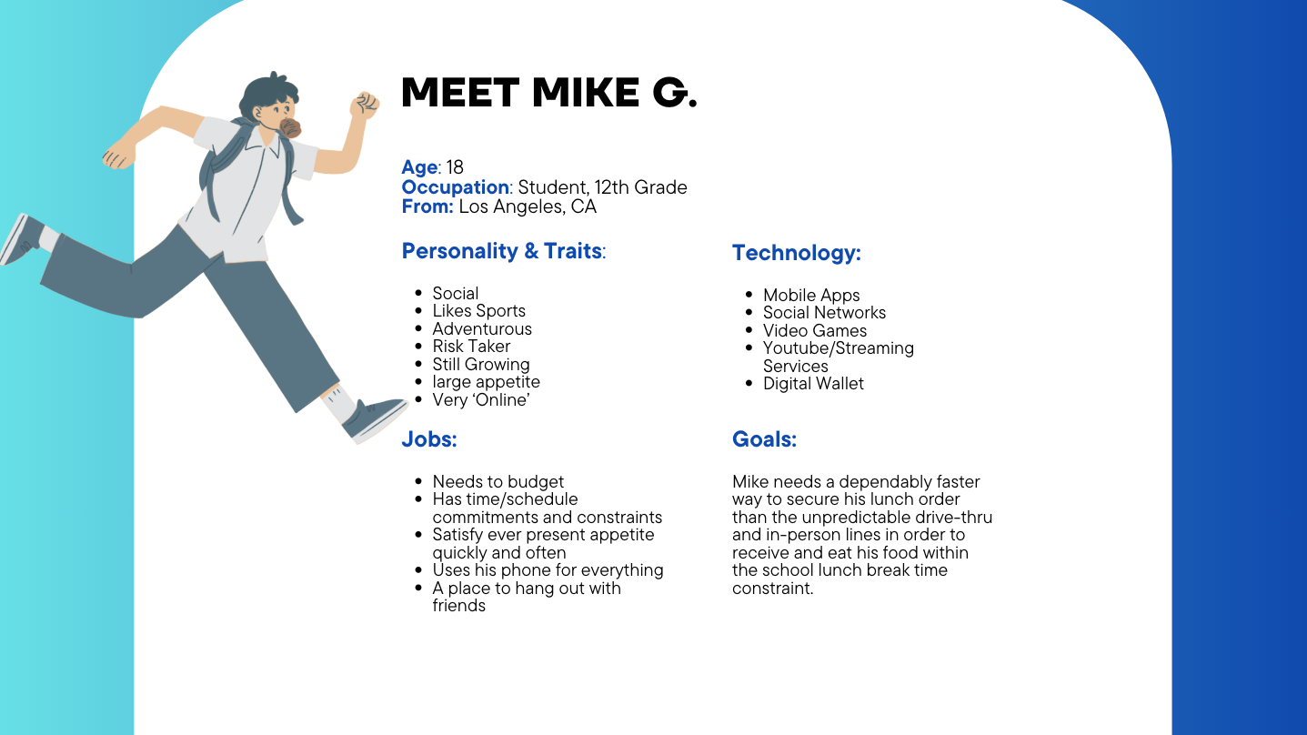
Customer Persona & Journey Map
Using our customer profile, we created a user persona which guided the progress of the customer journey map to help us empathize with our target user audience.
As the In-N-Out website is not created for food ordering, we did an in-person field study to find improvement opportunities and voted on which we thought were most important to pursue.

Define
Market Research :
Why an Order Ahead App?

The current In-N-Out demographic is 24-34 with opportunities for growth in 18+ audience. In fact, 29% Zoomers and 31% Millennials more likely to ordering out due to being busy.
As mobile app ordering for food services on the rise and skewing younger, they are on tighter budgets with money and time. An app with fast & easy access to digital wallet will keep In-N-Out from getting left behind.
Competitive Comparative Analysis
With more and more apps in the market, we wanted to align our design solutions with key market competitors, ensuring user familiarity and practicing best in breed designing.

Validating Our Strategy

We wanted to know if our research aligned with what customers actually wanted to ease their overall dining-out experience.
Through remote survey results, we saw which services users would value most within an In-N-Out app.
Defining Our Goals
Alleviate customer wait times by implementing in-app ordering, improving customer experiences through avoiding long lines and increase the frequency of their visits at In-N-Out.

GOAL 1
Provide approximate in-restaurant line times within app location services in order for users to compare local restaurant options and optimize their time when ordering in person.
GOAL 2
Ideate
Site Map
To help us envision the functionalities, information architecture and features of our mobile app, we created a site map as our outline. We starred categories needed to create an MVP.

Sketch: Crazy 8s
Utilizing a Crazy 8's format, we each brainstormed our design solutions, voted on our favorites, and discussed each member’s final iterations. As we had several different objectives to design for, we had 4 total rounds of ideation.
Below is an example of the first round.


Design
Lo-Fidelity Wireframes
Each of my teammates chose an ideation they wanted to work on.
I was responsible for designing the location pages as well as “stitching” our product together. This entailed editing each screen, maintaining UI branding and consistency, as well as constantly making sure our prototype worked smoothly.

Hi-Fidelity Prototypes
From low to high-fidelity designing, our focus was to design and edit solutions on the following screens:
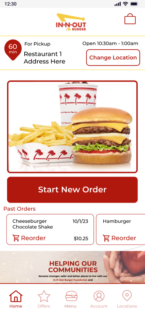
Intuitive home screen
Familiar in-app location services
Easy wait time comparisons
On-brand menu browsing
Simple item details page
Streamlined checkout
Multiple payment methods
Iteration 1 Clickable Prototype

Test
Using Maze, we gathered data on the usability of each version of our prototype and addressed user issues.
Remote User Testing
Issues:
Users unclear on how to start tasks
Cluttered visuals causing customer frustration
Hierarchy of information confusing to users
Home Screen
Solutions:
Mobile friendly button sizes & clear language
Information architecture organized with ‘order’ and ‘location’ first
Apply minimal design
Before
After
Before
After

Issues:
Currently no way to compare wait times
Users confused with inability to click on pins Confusion with two store details.
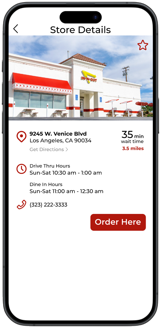
Location
Solutions:
Create in-app location services with wait time comparison
Fast and easy way to select location using large pins on map
Single location window shown with pin


Issues:
Menu Organization
Avoid unfamiliar language to brand
Consistent imagery
Menu & Details
Solutions:
Categorizing menu items from most popular to least
Stick to familiar menu browsing and customizations
Include all In-N-Out customizations
Before
After


Issues:
Currently no way to order ahead
Customers want easy/quick payment options
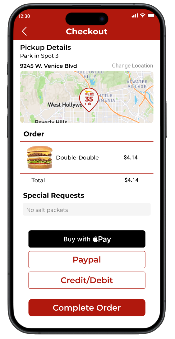
Checkout
Solutions:
Create order ahead & checkout options in app
Offer customers options for payments
Add customer delight to completed orders

Before
After

Final User Survey Results
Though a survey, 100% of our testers answered they would download this app to help them to save time, avoiding long in-person lines, check restaurant wait times and use apply pay.
These responses directly correlate the pain points we wanted to address through the product & solutions we built.

Final User Testing Results
To ensure a successful product, our design underwent 3 iterations and user testing rounds.
Each round of testing proved our design increased in usability and success, with our final round of designs leading to 100% success.

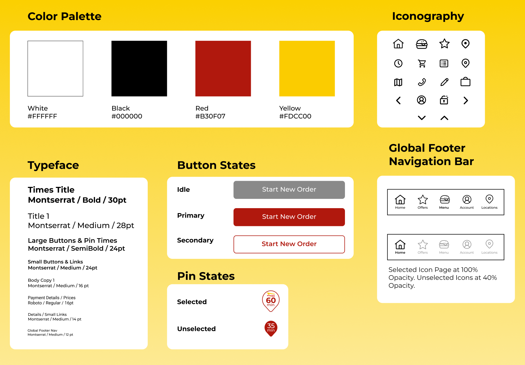
Final Design
I made a style guide for my team and I to reference to easily maintain consistent UI across our collaborative designing.
Style Guide
Try the prototype out for yourself by clicking here!
Or, watch a demo by scrolling below.