Utilizing user engagement to create more personalized playlists & discovery.
UX UI CASE STUDY | UX Project @ UCLA
Overview
Spotify sure gets its share of user complaints. But how legit are these problems?
Through various UX research methods, the data concluded unanimous gripes about discovering new music and content organization.
Thus a new savior Spotify was born! I reorganized the app and created a feature that engages users to discover new music with a curated playlist of their dreams.

Roles & Responsibilites
Sole UX UI Designer
User Research
Prototyping
Usability Testing
Duration
Sprint - 3 Weeks
Tools
Figma, Miro, Maze, Zoom, Google Surveys, Paper & Pen
Tags
Feature Design, User Engagement, Good Vibes
Phase 1: Research & Context
To better understand the context of Spotify, I conducted the following UX research steps:

Informal Poll
To sniff out some possible problems, I sent out a quick, informal poll to a random group of Spotify users, asking them what frustrations they have with the streaming platform.
This helped me define what to look into further and noted seven of eight people mentioned types of audio content (ie podcasts vs music) weren’t separate enough and wished discovery was easier.
UX Audit
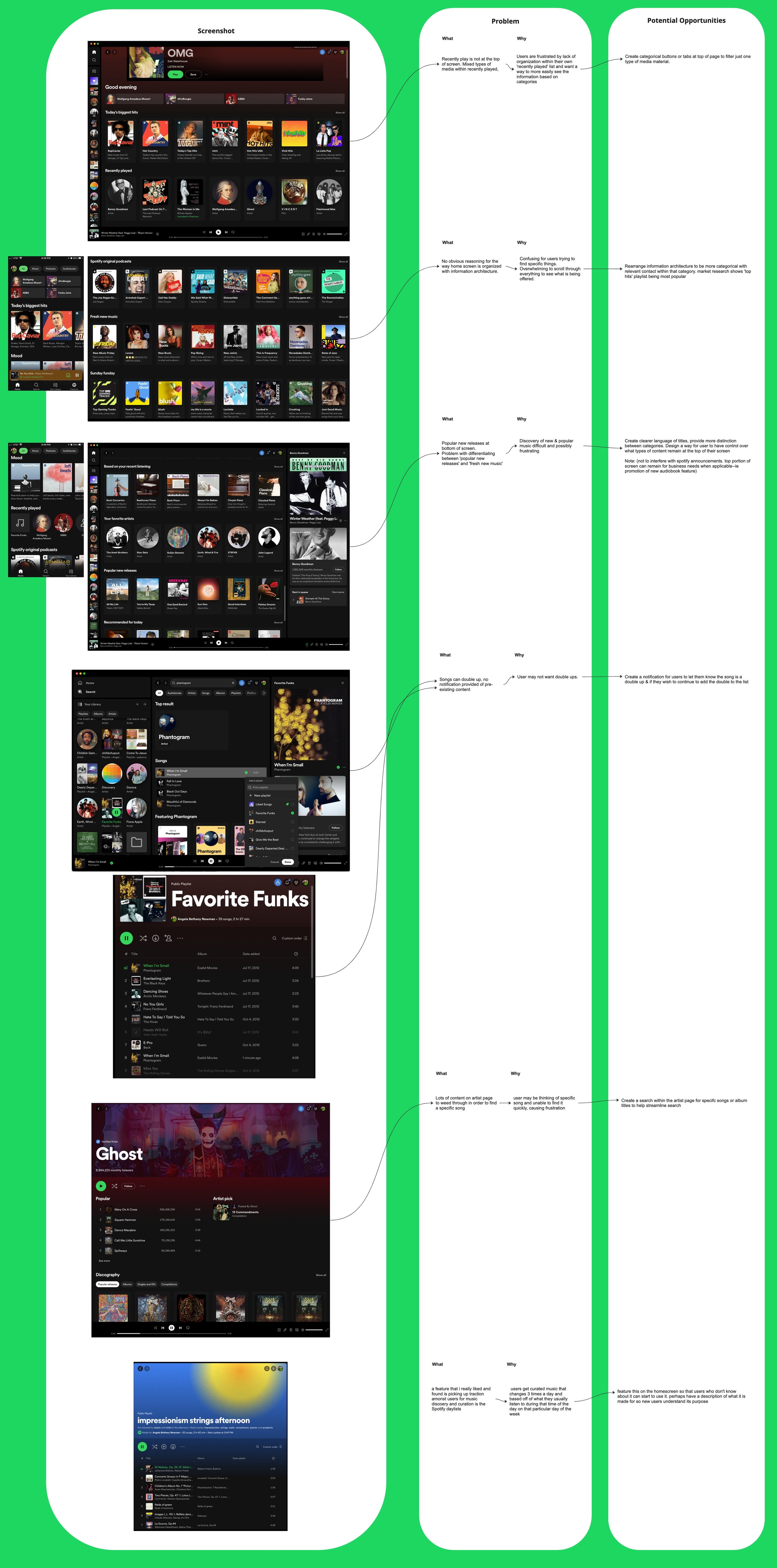
I don't use Spotify, so it was essential to gain insight on the app functionalities, features, and points of friction. I conducted a UX audit to glean first hand experience & start validating if there was a method to the madness users mentioned in the informal poll.
And guess what?
That madness was valid.
How Might We Statements
Using the HMW formula, I started thinking of potential opportunities to relieve user pain points to address issues noted during the previous two UX methods.

How Now Wow
I placed my HMW statements onto a How Now Wow Matrix to prioritize ideas worth focusing on for this sprint challenge.
Post-its in the ‘Now’ were to be the focus of my sprint challenge.

Market Research
Market and demographic research helps identify who the ideal audience will be & what problems they would have.
Completing this step ensures I can try to create a user persona who represents the majority of users, and will guide me to solve problems with the furthest reach & added value.

Note:
Including research links within my process board is extremely valuable for revisiting original insights and expanding upon them.
User Persona
Meet Lee!
Lee was create as an ideal user persona based off of the existing demographic of Spotify users. It’s nice to put a face to a problem in order to more realistically empathize with specific user goals or frustrations.
Creating a user journey map will go (in progress) and tailor pain points they may experience, further helping me address design solutions to pursue according to their needs.

After researching, I’ve got a hunch🕵️♀️ — But my hunch is meaningless actual user responses.
Time to pass the mic over to Spotify’s beautifully frustrated patrons that make my job fun.
Phase 2: Define & Validate
To help define my challenges & validate my hypothesis I completed the following steps:
Customer Journey Map

A user journey map using Lee helped define exact points of friction were happening within the Spotify user experience.
Lee’s major frustrations were looking through content on homepage and music discovery.
Structuring the Challenge
Now that I had my ideas, I needed to put them into concrete challenges to focus the remainder of this sprint.
To start envisioning a challenge for this sprint, I used a *formula to structure my statement.

Formula:
*‘Create [what] <for whom> <by when> <in order to>.

Formula Components:
•[what] = the deliverable
•<for whom> = who is your user based on what they’ll be doing in the app/product
•<by when> = time frame
•<in order to> = goal, what you’re helping users solve


My challenges:
“Create distinct content categories to separate podcasts, music and audiobook content on the homepage and address user complaints about the current lack of content distinction.
“Create a discovery playlist maker to help Spotify users explore of new music and address their complaint of lack of new music options.”
User Survey & Findings
Challenge accepted! Now to validate my hypothesis with a user survey.
My goal was to collect data from 11 users and compare the results with my challenge to see if my proposed solution would address common user problems.


The results are in — survey says?!
Top complaints:
• difficulties with discovering new music (4 mentions).
• lack of separation between types of audio content (5 mentions).
Top feature desired:
• ways to create new playlists and/or discover new music or podcasts.


Competitive Comparative Analysis
Based off survey answers, the top two competitive streaming services were Apple and Youtube Music.
Results:
• No features for discovery.
• Lots of suggestions based on user moods.
• More space between listed content
• More distinction between types of content.

Is it just me, or do you feel a storm coming?
It’s a brainstorm! 🧠 🌩️
(cue immediate regret of dad joke)
Phase 3: Ideate & Design
To start my ideation and design stage of the sprint I used the following UX methods/tools:
Gathering Design Assets
As this was a 3 week sprint, I had to think smart about time.
I gathered style guides and design system assets from the Figma community, allowing me to design my prototype & validate my design faster.

Crazy 8s
With the ideation gears turning, this sketchpad was burning!
For potential design solutions, crazy 8s helped me put all my ideas on the table. Sifting through the silt to get to the gold, I starred components I liked from each iteration.


Final Wireframes
Using starred components from each ideation, I came up with a wireframe that seemed to be the best solutions to my design challenges.
With this final sketch as my guideline, I built my high fidelity prototype.

Hi-Fidelity Prototype

What was Built
Content Categories
• Distinction between content listings with specific language. Ie. music listings to be defined as playlists, artists, or music.
• Content tabs at the top of the screen so users can select what content they want to see. This feature exists on mobile, but not on desktop.
• Title of content being displayed according to tab selected. Eg. ‘All’ title for ‘all’ selected tab.
• Discovery & suggested music at the top of screen. Content users consume most is music, and top complaint was not having these categories at the forefront.
• Added a way to listen to next episodes on podcasts through ‘Play your next episode’ list. This addresses a complaint for Spotify podcast listeners.
• Added ways to explore content through genres to add UI interest and help users journey to discovery.
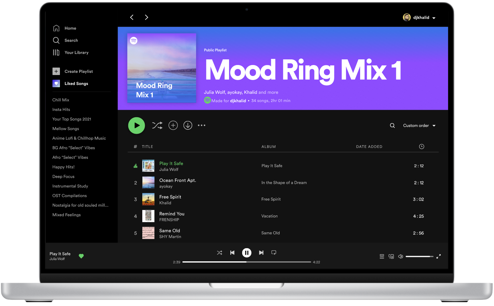
‘Mood Ring’
• A feature that allows users to take a quiz and discover new music according to their responses
• Featured ‘New’ content box under discovery category within ‘All’ and ‘Music’ home screens
• Icons and Buttons with engaging colors and graphics for users to select choices based on prompts and feel more in-touch & add user control with the personalization of their music.
• Prompts include users to choose their mood/vibe, genres, activity, and whether they want all new music or a mix of new and old.
• Clear and engaging language to prompt users in an easy and intuitive way.
• Two ways to discovery. ‘New music’ having no favorited songs, and ‘A mix’ having half favorited and half new songs.
Testing 1…2…3…
Calling all users, come in users. 🤳
The eagle has landed, I repeat, the eagle has landed. 🦅
Phase 4: Test & Iterate
To start my testing & iteration stage of the sprint I used the following UX methods/tools:
User Interviews
I chose 3 users similar in demographic to my ideal user persona, for a prototype walk through.
I asked them to fulfill certain tasks while thinking aloud to collect user data on what worked and didn’t with my first prototype iteration.

“I think Playlists I Love’ should be more easily accessible. The copy should also be consistent between content tabs.”
”I love Mood Ring, I wouldn’t change anything. It was really easy to use and fun!”
“I like that new or suggested content is easy to find but the 'recently played’ stuff should be at the top too. Artists could be lower.”
”[Mood Ring] feels like something Spotify should already have.”

Remote Testing
To see if what my interviews revealed about Spotify’s newest (and very unofficial) features resonated with a wider pool of testers, I deployed a remote test using Maze.
I wanted to see how the features did on a usability test and what other feedback users had.


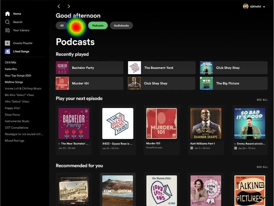
The Data
These heat maps from the remote usability testing indicate the flow of all users when prompted with a task. (Red indicates highest volume clicks.)
Data shows users had a very clear understanding & action response of the both prototype functionalities when asked to show a) how they would filter specific types audio content and b) their use of Spotify’s newest feature.
Usability Testing Results for Content Categories
Users liked :
✓ - content tabs at the top
✓ - Feature UI
✓ - Organization useful and intuitive
Users wished for:
Ø - category placement (ie. ‘artist’ category to be lower)
Ø - undistinguished copy between category types
Users overall experience:
100% users said they enjoyed & would use this feature to curate playlists and discover music
Usability Task: Users asked what action they would take to filter podcast content only.
Usability Success: 90%


Usability Task: Users asked what action they would take to filter music content only.
Usability Success: 90%

Usability Testing Results for ‘Mood Ring’
Users liked :
✓ - Personalized curation
✓ - Intuitive & engaging UI/UX
✓ - Discovery choice
✓ - Easy to understand
Users wished for:
Ø - Less choice options (1)
Ø - Higher ‘Next’ button (1)
Ø - More instruction (1)
Ø - Added visuals (3)
Users overall experience:
83% users found it to be intuitive, easy to navigate, and straight forward
Usability Task: Users asked how they would get started using the newest Spotify feature.
Usability Success: 100%


Usability Task: Users asked to select their moods, then continue.
Usability Success: 100%


Usability Task: Users asked to select playlist genre(s), then continue.
Usability Success: 100%


Usability Task: Users asked to choose any activities, then continue.
Usability Success: 100%


Usability Task: Users asked to select between all new music or a mix of new music and tunes they already love.
Usability Success: 90%


You know why I love listening to negative feedback?
(no, i’m not a sadist)
More positive product results!
Time to implement that user data. 🫡
Iteration - Final Product
Content Categories
Rearranged:
Highlighted artists category to be more towards bottom of both ‘All’ and ‘Music’ homepages
‘Playlists you love’ to be at top under the music features ‘Mood Ring’ and ‘Ai Dj’
Changed copy:
’Artist you most listen to’ to be ‘Artists you’ve most listened to’
’Playlists you’ve loved’ to ‘Playlists you’ll love’

‘Mood Ring’
Eliminated some ‘mood’ choices.
Scooted the ‘next’ button higher towards selection options.
Added direction copy.
Rearranged choice options higher on screen and narrowed size of the ombre graphic.


Conclusive Data
Users Want These Features!

100%
Features made to address new music discovery had a 100% usability success rate.
100%
All users commented on the user interface and language on home screen to be easier.

90%
Features designed to address content categories had a 90% usability success rate.
100%
All users said they would use ‘Mood Ring’ to discover new music to alleviate their main pain point when using Spotify.
83%
Users commented on the hierarchy of content to make more sense than Spotify’s current layout.
83%
Users said that the category tabs and some of the category content lists would make their Spotify experience easier.